The new logo for NintenDaan! We wanted to keep things very minimalistic and thick, to make sure that his branding comes accross as professional and general. We choose to cut the N and D together to create a contrast between the word Ninten and Daan, because otherwise it wouldn't be visible enough with the text alone.

Here is an icon version of NintenDaans branding. I really like this icon, because it's still very visible and clear if you look from it at smaller sizes or from a distance.

And here is an icon of Daan I drew in our first sketches for the branding when we at first started. He's probably not gonna use this for his channel, but I still thought it was a novelty to show of! Who knows~

The social media banner for NintenDaan. To keep the minimalstic look, we choose to create a angles strip to keep the cut theme alive in the branding.


The multiple endslates that Daan will use for his content. I let each represent the menus of the console or handheld like people expect them to be. For instance, the eShop branding resembles a lot of the menu you see on the 3DS with the small outer glow edges and the different borders.


And here are some of the thumbnails for NintenDaans channel. The color and negative shapes will resemble the kind of content that Daan wants to present. Daan was inspired by an old radio broadcast poster so we thought it would be cool to implement the same idea over here.

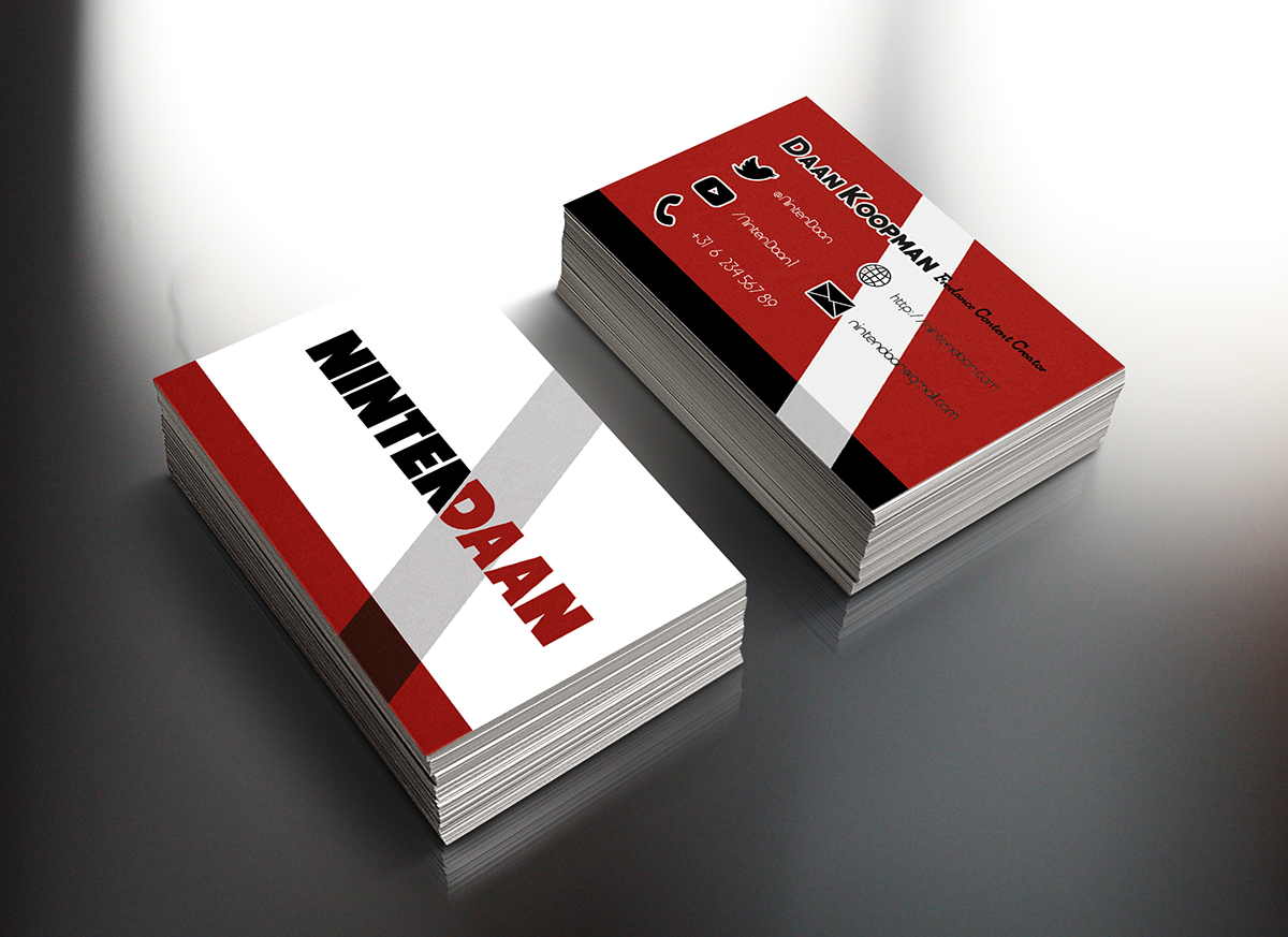
The new business card of NintenDaan! Last year, I made his old business card, but I thought it wasnt iconic enough to stand out on it's own identity. Luckily, I changed it with his branding aswell and I think it looks much better~

and here is the logo for his side porject called "Double Dash Radio", a radio broacast station that will be released in the future! It will consist out of video game music! I love that the carwheels also represent vinyls.

This is the icon for Double Dash Radio! As you can see, it resembles a microphone, but also a mario mushroom at the same time!

and last but not least, the Twitter banner for Double Dash Radio! I wanted it to fade from red to white, but I thought it would be cool to do that in the shape of a race flag, to keep the theme of racing in it!


